Fine-Tuning Accessibility: App-Specific Settings on iPhone
A small but powerful feature hides at the bottom of your iPhone’s Accessibility settings. Per-App Settings lets you fine-tune how each app looks and behaves — from text size to Smart Invert — creating a more comfortable, personalized experience.
Sometimes the best improvements to your iPhone experience aren’t big overhauls — they’re small, thoughtful adjustments. One of those little gems tucked inside the Accessibility menu is called Per-App Settings. It’s easy to overlook, but once you start using it, you’ll wonder how you ever got along without it.
Where to Find It
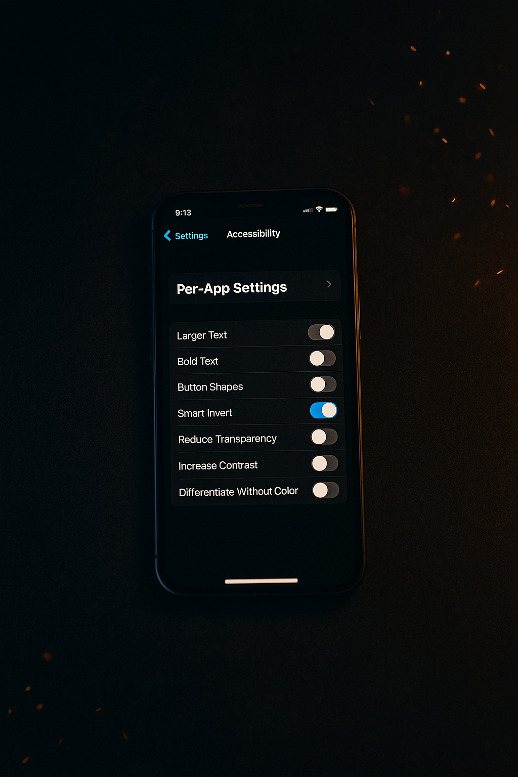
Open Settings → Accessibility, and scroll all the way to the bottom. You’ll see a toggle labeled Per-App Settings.
When you tap into it, you can choose which apps you want to customize. From there, tap Add App, and select any app installed on your device. Once you’ve added one, you’ll see a range of familiar options you can fine-tune specifically for that app.
What You Can Adjust
Here’s where it gets powerful. You can control several accessibility and visual preferences without affecting the rest of your phone, including:
- Text Size – Make the font larger or smaller than your global settings.
- Bold Text – Add a little extra weight for readability.
- Smart Invert – Automatically reverse colors in a way that keeps images and media looking natural.
- Reduce Transparency – Helps improve contrast and legibility.
- Increase Contrast – Enhances separation between elements.
- Differentiate Without Color – Useful if you rely on shape or contrast more than hue.
Each app can have its own unique setup. That means you can read comfortably in one, browse normally in another, and work efficiently without constantly diving back into settings.
Why It Matters
If you have low vision, visual fatigue, or simply prefer a darker, cleaner look, Per-App Settings are a game changer.
Maybe you like Smart Invert on Mail, so messages appear against a dark background. Or perhaps you want larger text in the Amazon app, where product descriptions can feel cramped. You can set all of that once and let iPhone remember it for you.
It’s a quiet feature, but it puts a lot of control back in your hands. The best accessibility tools aren’t flashy—they simply help you use your device in a way that feels natural.
Final Thoughts
The next time you’re adjusting brightness, text size, or color settings, take a few extra seconds to explore Per-App Settings. Tailor a few of your most-used apps and see what a difference it makes.
Little refinements like this can turn your iPhone from something you use into something that truly fits you.